Blog / craft
Designing docs for humans
Why design still matters in the age of AI and our docs design principles to clean up mental clutter.
Kevin Liu, Taylor Fang




Why design docs?
Documentation is an open problem in web design. There are patterns and anti-patterns everywhere, replicated ad infinitum across ready-made templates. Templates are fast and easy, but tend to fit the conceptual map of a specific application into a ready-made mold. They risk treating docs as an afterthought to prettify in boxes, rather than to structure as a mental model of the product for the user.
Further, the consensus options are often “over-designed” with visual effects that tax the reading experience. We believe docs sites need a simpler reading experience focused on content, leaving more elaborate designs to the marketing site (as the creator of Fumadocs has shared).
But in a world where agents are the majority of docs readers (as well as docs creators), why should you design your docs site at all? Should you even put effort into human readability and visual design?
We believe an intuitive, intentional docs interface becomes even more important in the world of AI slop. Our belief comes from a care for the craft of design and obsessing over our product experience. But it also comes from the observation that humans still look at and read docs. Yes, agents are mass executors of code, but statistics on sheer volume don't capture everything. Humans still look at docs sites to understand and evaluate a product. And humans increasingly need interfaces which clean up mental clutter and guide their attention to what's important.
We approached our docs redesign from scratch, starting with the parallel user journeys we explored in our content rewrite. There are only a few docs primitives: navigation, search, controls, links, and content. We arranged these with less lines and more open space for a cleaner visual experience, building on the open-source docs framework Fumadocs for maximum composability.
We work hard on our writing, and we want people to read it. The continuous goal is to design and maintain a docs site that makes the reading experience smooth and even delightful. We’ve developed some core design principles along the way. The first is to adopt a familiar, understandable interface.
Intuitive flow and direction
Docs help users build a mental model of the product and how it works, as we wrote about in our docs content rewrite. Our design flowed from the same core mental principles: deliberate and meaningful organization, complexity and customization revealed progressively, and details that feel unobtrusive and even invisible.
Each area of the screen maps to a unified action or output, so functions are surfaced to users where they expect to find them. (Because we’ve found that some users have a strong preference for visual themes, the mode swapper appears in two areas.)

And the page supports an intuitive flow, funneling users towards what they want to achieve.


The docs highlight links to actions users might want to take, like going to the Changelog for updates, asking a question for support, or getting a demo of the product.
Cleaning up mental clutter
Interfaces are increasingly cluttered. Elements like “eyebrow text,” random animations that move in multiple dimensions, and extraneous boxes (with rounded corners) are telltale signs of AI design. The consequence of this visual clutter is an accompanying mental clutter. When each component exists for the sake of it, without a considered placement and relation to other components, meaning dissolves.
So our first job is to cut mental clutter. This means deleting extraneous elements; in our case, a lot of extra lines, links, and buttons.


But it also means structuring, reorganizing, and radically simplifying. In particular, we consolidated navigation surfaces, as the map which organizes and points to the site’s mental concepts.

Our sidebar is now one singular accordion. It doesn’t sound revolutionary, but has become a rarity in docs sites, which often show multiple section navigation bars in multiple places, both vertically and horizontally.


CI enforces a clear hierarchy for the sidebar, preventing it from becoming a daunting list of links and options all at the same level. And it persists: clicking a link doesn’t change the sidebar options entirely or make you lose your place when you try to go back.
Drawing the eye
An intuitive flow also teaches the user how to move through the interface. We wanted to draw the user’s eye naturally to important areas by implementing more visual hierarchy: for navigation, controls, content, and actions.
a) Using icons in important areas to break up walls of text.

b) Adding more separators between text sections to group content and make section divisions more apparent.

c) Styling text differentially, including using italics (which docs tend to fear) and lowering weight to 400 for body text.

We especially wanted to create a lot of white space to give the content breathing room, inspired by the Linear docs. The Quickstarts page redesign helps illustrate these principles integrated together.

A unique GT flair
Docs sites are still webpages that shouldn't feel lifeless. While careful to not over-design and detract from focus on content, we also added “micro-UI” details to help fit our docs into the GT brand aesthetic and world.
We built a subtle interaction on the iconic Fumadocs table-of-contents component. It works with server-side rendering as an SVG mask, with a 12px nesting level and faint blue thumb that follows the pointer. The mobile drawer draws the same geometry statically, since touch has no hover.
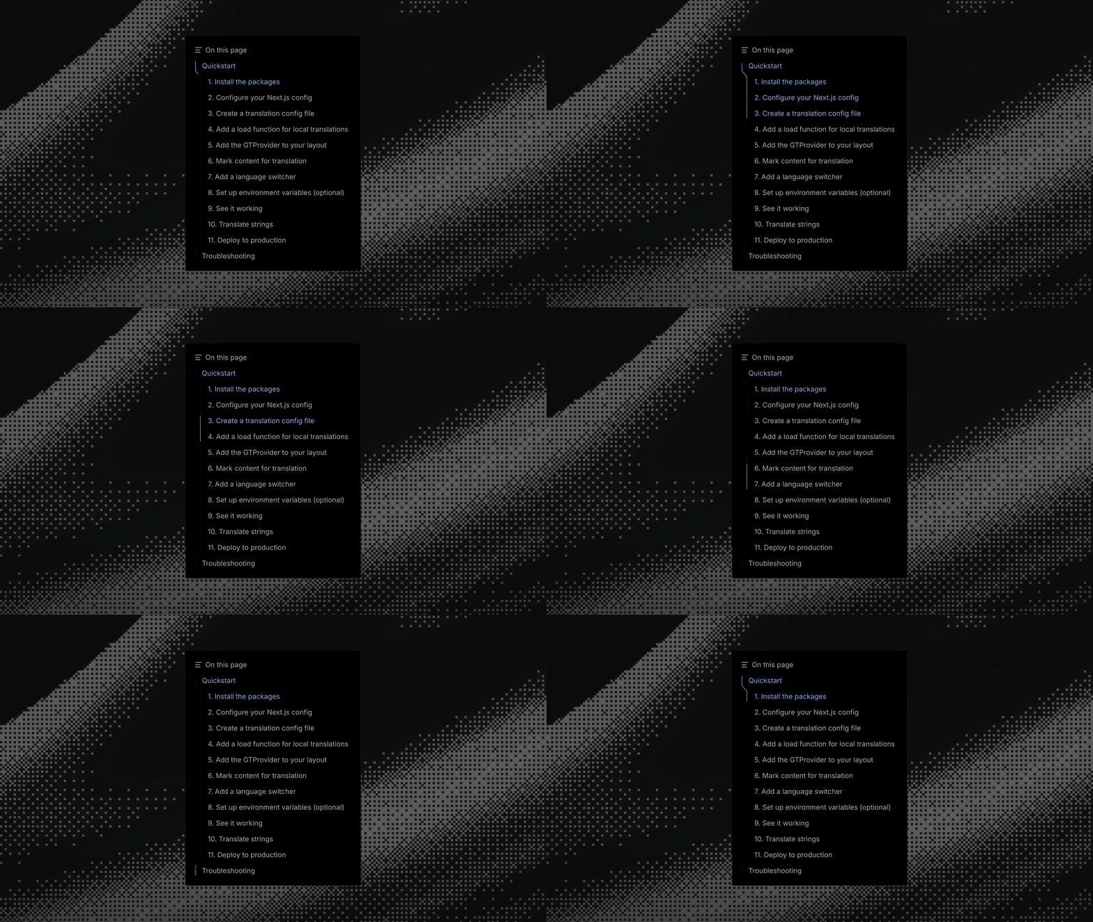
We applied the same mask to the sidebar. Click through a section from top to bottom and the blue thumb slides along the rail, bending inward where the tree nests and following the pointer row by row.
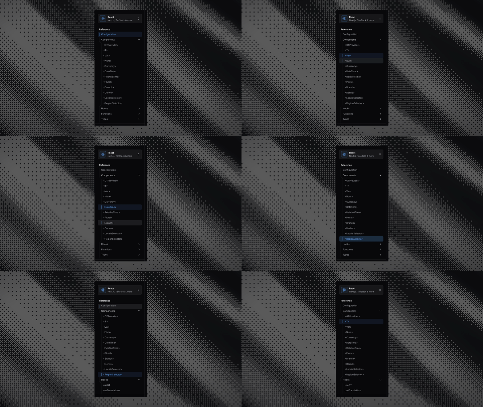
We also curated other UI primitives to counteract AI design symptoms. We use only solid icons and less rounding on boxes. We implemented consistent scrollbars across the sidebar, code blocks, and menus, instead of the default mix of native and overlay bars. And we use custom flag SVGs for our language switcher rather than flag emojis, to preserve matte visual iconography and match our landing page.


And of course, our docs localization experience must be top-tier: preserving spacing, alignment, and order.

The hit list
Throughout the process, we developed a “hit list” of anti-patterns we noticed.
- Eyebrow text
- Random extraneous explanatory text
- Over-rounded boxes
- Non-solid icons
- Variable spacing not attached to importance of content
- Non-localized docs (!)
- Multiple navigation elements spread across the page
- Sidebars that seem to expand infinitely
- Sidebars that change when you click something
- Sidebars where you lose your place


We're of course continuously working to improve our docs design and welcome any feedback. Happy docs designing!